Now that’s a big question. But the answer is not as complicated as you might think.
A visual identity is everything that makes your brand unique. In a way, it’s like what makes you YOU. You have your own personality and you choose the style of clothes that suit you, the music you like to listen to, your favourite colours etc. Well, a brand is the same, except it doesn’t wear clothes.
In the process of creating your brand’s visual identity, you will have to think like him (or her if you consider your brand to be female). It’s not about what YOU like, but what your brand should look like to express itself.
The logo
The main body of you brand’s visual identity is the logo. It’s the face that everyone is going to recognise. So it’s rather essential to have one. Since no one likes to look plain, creating a logo can be the most time-consuming part of the branding process. We want to get it right and we want people to understand who that is.
So, is it impossible to have a visual identity but no logo?
No, that’s not impossible, but generally that’s making your life more difficult than it should be. You’d be surprised to know that Etsy doesn’t have a logo. It’s literally a serif font in an orange box and it’s so basic that it doesn’t qualify for copyright! The only issue is that anyone could steal their style, and if it wasn’t as popular as it is now, it wouldn’t be noticeable. The reason why it works, is that they sell so many different things that it’s best to let the products talk. Yet, the creators had to pick a font, which leads us to our next section.
No, that’s not impossible, but generally that’s making your life more difficult than it should be. You’d be surprised to know that Etsy doesn’t have a logo. It’s literally a serif font in an orange box and it’s so basic that it doesn’t qualify for copyright! The only issue is that anyone could steal their style, and if it wasn’t as popular as it is now, it wouldn’t be noticeable. The reason why it works, is that they sell so many different things that it’s best to let the products talk. Yet, the creators had to pick a font, which leads us to our next section.
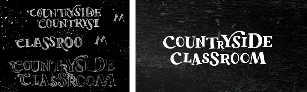
Countryside Classroom is a great example of a hand drawn typographic logo that comes to life by the use of swashes and a variable base line.
Fonts
After the logo, the choice of fonts would be the most important. Maybe the logo is already using a font, so you might want to use it as you core one. I usually like to work with 2 contrasting fonts, as I find it gives more depth and flexibility to the brand. One is usually used for copy while the other works as a supporting font for quotes, highlights and such.
Are fonts really expensive?
Not necessarily. There is a wide choice of free fonts, both for print and web. Going for a paid font gives you more options for sure, and it’s also a way to do things different from the others. Another option is to get a custom font, which means that no one else can use the same one. Now that’s really cool.
Not necessarily. There is a wide choice of free fonts, both for print and web. Going for a paid font gives you more options for sure, and it’s also a way to do things different from the others. Another option is to get a custom font, which means that no one else can use the same one. Now that’s really cool.
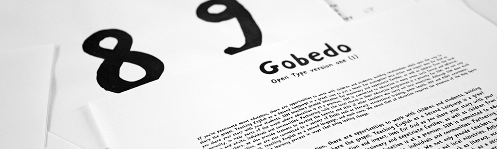
Here is an example of bespoke font developed for Serving in Mission. It is used in their logo and works as a supporting font too. Each letter was painted by hand, scanned and vectorised into a font development software.
Colours and Textures
If you look at a rainbow, you might think there aren’t so many colours to choose from. Wrong! There are so many tiny variations that can make a colour look good or not. While building a brand, a colour palette is always created. It usually holds a core palette with a couple of colours that are used throughout and a secondary palette that comes to support it.
There are many ways to use a colour palette. You might want to keep things very simple and only use two colours, making your brand very cohesive and minimal just as you might want to use an array of colour combinations to suit different purposes. In both cases it can work, if that’s what’s right for your brand.
Should I look different or fit in the mould?
That’s a decision for you to make as long as it represents your brand. It’s always a good thing to compare your market and see the colours others are using. Some sectors will use similar colours, which doesn’t mean you have to do the same. But don’t think that you have to look out of place just for the sake of it. Your products should come first.
That’s a decision for you to make as long as it represents your brand. It’s always a good thing to compare your market and see the colours others are using. Some sectors will use similar colours, which doesn’t mean you have to do the same. But don’t think that you have to look out of place just for the sake of it. Your products should come first.
Do I need textures?
I love using textures as I find it adds a subtle touch, but it’s not something I choose just to have it on my list. A very modern brand might not benefit from textures so if you can’t think of any, just put it aside.
I love using textures as I find it adds a subtle touch, but it’s not something I choose just to have it on my list. A very modern brand might not benefit from textures so if you can’t think of any, just put it aside.
Imagery
Depending on your brand, your services/products, you’ll need to use photography or illustration or both. Service based businesses tend to favour people in photography but there are many ways to photograph them. Wide angle, close-up, out of focus, black & white etc. It’s the same thing with products. Would they work better on a plain background or an outdoor photoshoot?
Are stock photos bad for my brand?
No, I have used many stock images in the past and if they are picked right, they won’t look ‘stocky.’ There are some free images websites that you can use, just be aware that more people use these photos. So if you can afford to have your own photographs taken, do that.
No, I have used many stock images in the past and if they are picked right, they won’t look ‘stocky.’ There are some free images websites that you can use, just be aware that more people use these photos. So if you can afford to have your own photographs taken, do that.
Illustrations are a great choice to display more personality. They are really useful for infographics and icons in particular. They don’t have to look playful or childish. And you can go modern with vector based visuals or entirely handmade with paint, stamps, collage etc.
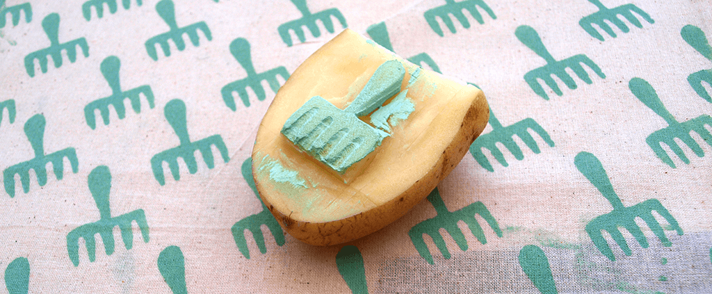
Illustration will always be my first choice to create a one-of-a-kind brand. Here is some research for Countryside Classroom patterns that were used on the website banners.
Tone of voice
Since most of your content will be written, choosing the right way to write is essential. The tone of voice is by definition the way your brand will talk to its potential customers. It’s not about what it says, but the way it says it. It can sound formal, friendly, funny, technical, brief, quizzical and so on.
If you have people working for your brand, the tone of voice will also be reflected in the way they talk to the customers. Think about IKEA and how vital they make it for their employees to understand its values.
Should my tone of voice be technical if I have a complex business?
That depends what you expect your customers to understand. Generally, I would advise a tone of voice to feel as human as possible and to keep things as clear as simple as it is doable. What is usually valued in a brand is its authenticity, its honesty and openness so try to use that in your tone of voice.
That depends what you expect your customers to understand. Generally, I would advise a tone of voice to feel as human as possible and to keep things as clear as simple as it is doable. What is usually valued in a brand is its authenticity, its honesty and openness so try to use that in your tone of voice.
There you are, here are the things that makes a visual identity. There could be a few more elements, but that generally depends on the brand and it’s something that we would define together before any work begins.
Excited about your new brand’s identity? Let’s get to work then.