When I was approached by Nathan from TCS (Teaching Children Sport), he was desperate to get his brochure re-designed after receiving a very bad update. I discovered a brand with ne coherent styling or defined guidelines. Despite the small scale of the project, I wanted to use the brochure to develop a brand that could be expanded in the future.
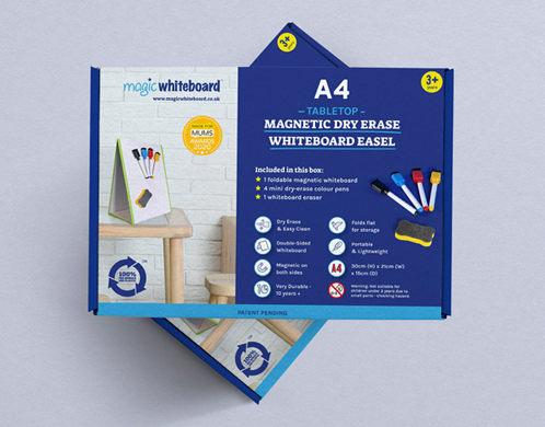
The only prerequisite was to keep blue as a main colour. These brochures are initially addressed to teachers and parents but I wanted to keep a child-friendly approach as they are the main target of the service. I chose to use blue in various shades and a very bright yellow to create a bold look and a minimal style. Textures and small illustrative elements are a great way to say that sport is about getting dirty and having fun and help bring structure to different sections.
Type wise, a round modern font was picked for content and a hand-written font was used for titles and highlights, creating visual contrast and impact.
