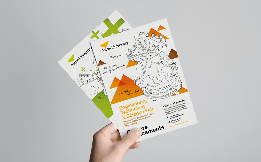
Through my agency work, Aston University is the longest lasting client that I've had. I was assigned to create the visual identity for their careers service. Renamed Careers + Placements, the identity was limited by the University's brand guidelines, which is very common for sub-brands.
Instead of finding a way out of the restrictions of the guidelines, I prefer to work with them. I compile all the information that I need and start placing things that cannot be changed. In this case, I couldn't create a logo, add new fonts or use more than a couplet of colours. The university also uses an invisible grid to which elements on the page should be aligned to.
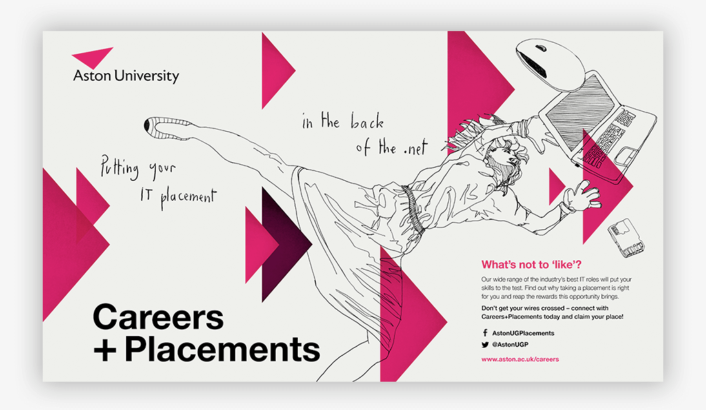
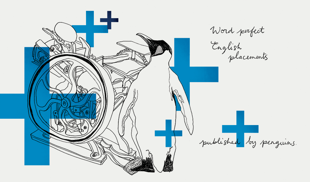
Rather than a logo, I create a namestyle. This is simply the name of the service written in the University core font, but the layout and the placement on the page makes it feel like a logo.
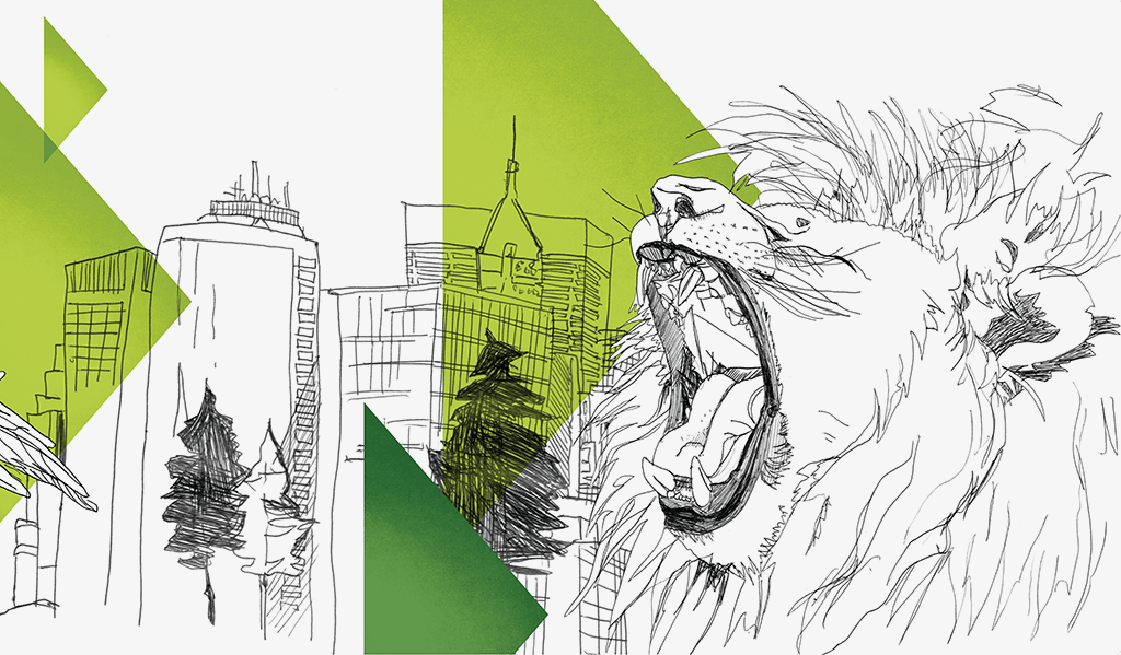
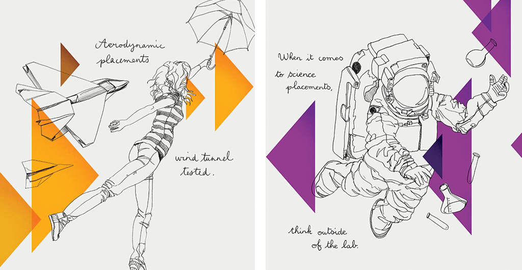
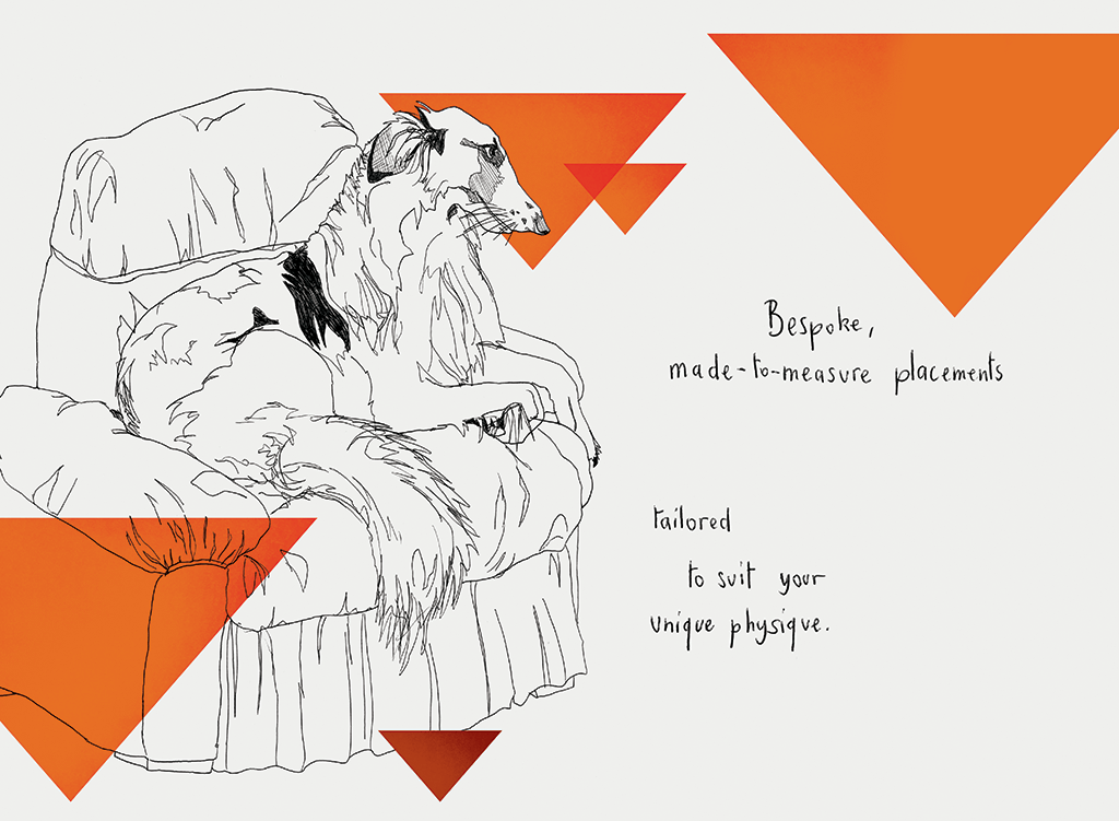
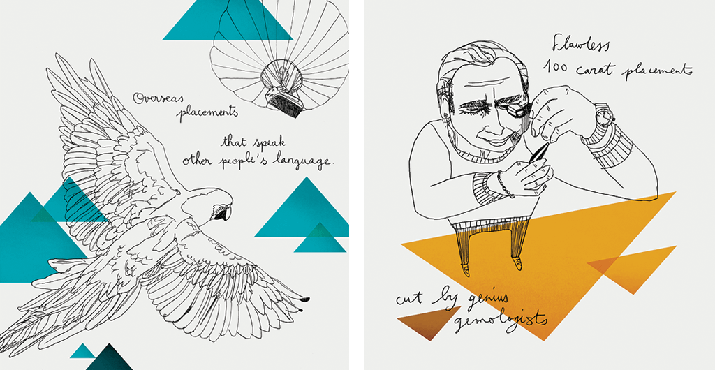
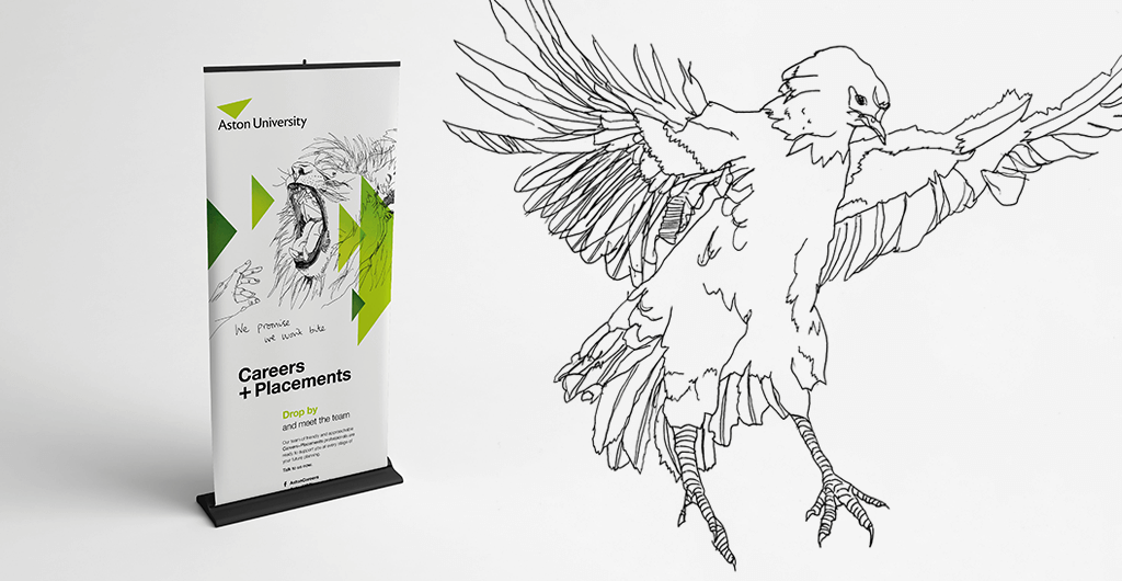
An illustrative approach was chosen because the service had always liked using bold and creative styles in the past, but never in a cohesive way. The outline illustration style is witty and fun. Triangles and + signs were used to complement the composition and add more impact and movement, all of which were aligned to the grid.
Here are some more close-ups of the many illustrations created for them.
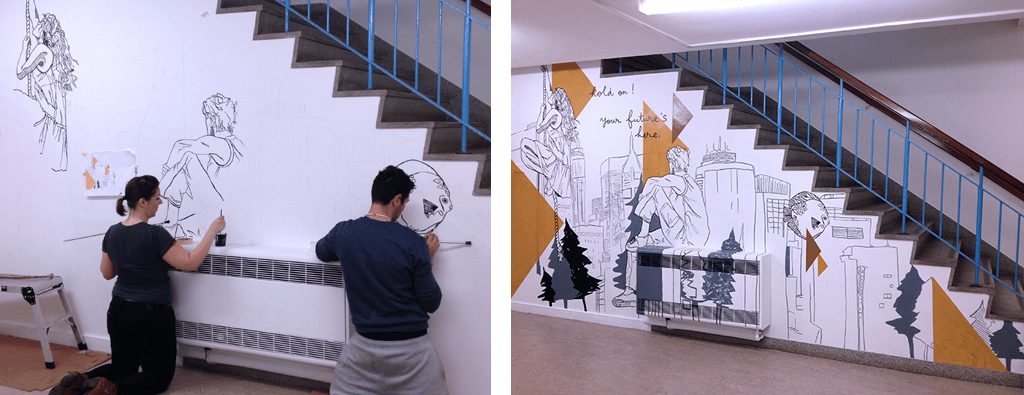
The largest piece of design was a wall art by the entrance of the Careers service. After taking exact measurements, I created the illustration and sent the blue print to HNS Signs. They recreated the illustration by hand and have a timelapse video to show you the incredible process.